Visual Design Studio in Berlin, Brand Identities, Visual Identites, Books, Posters, Websites
WORKS
SHOWCASE
DAILY
ABOUT
LINKS
CONTACT
Websites
Magazines
Hand-lettering
Posters
Illustration
Identity
Publications
GreenWheels
Consensys
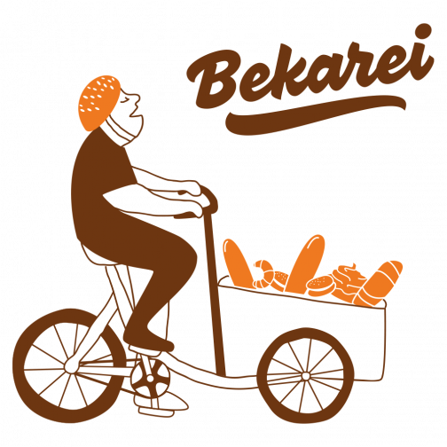
Bekarei
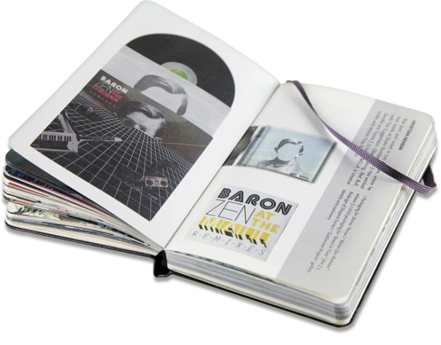
Moleskine Foundation
Colonia Nova
GreenWeb Foundation
Foto Arsenal Wien
White Papers On Dissent
Allezoop
Why is Everybody Being so Nice?
Risomania
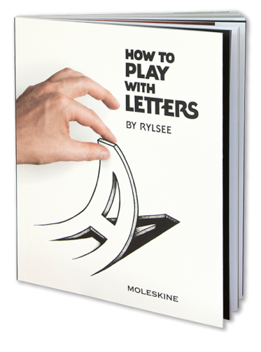
How to Play with Letters
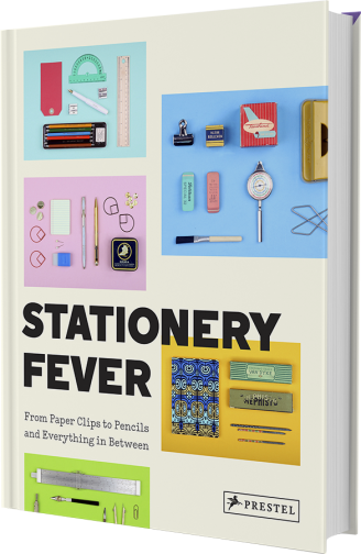
Stationery Fever
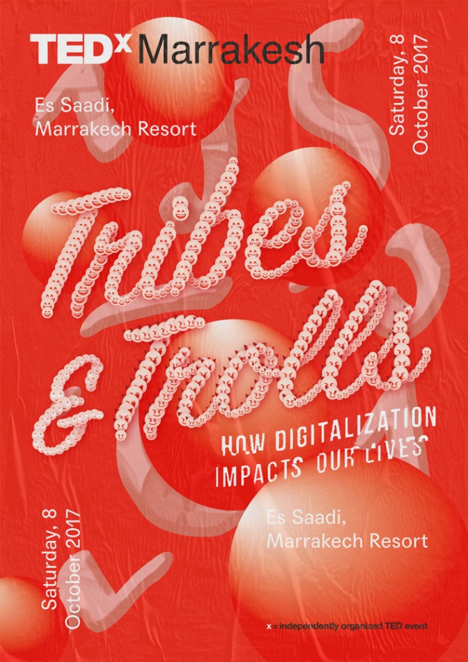
TEDx Marrakech
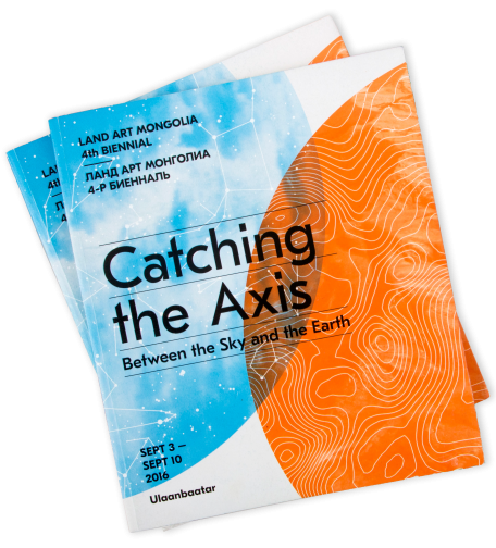
Land Art Mongolia
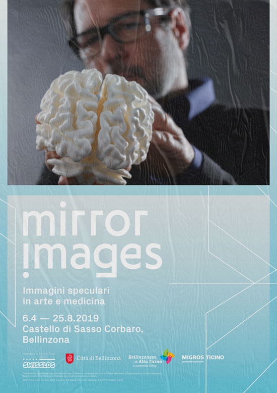
Mirror Images
Flos IC Lights
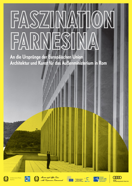
Faszination Farnesina
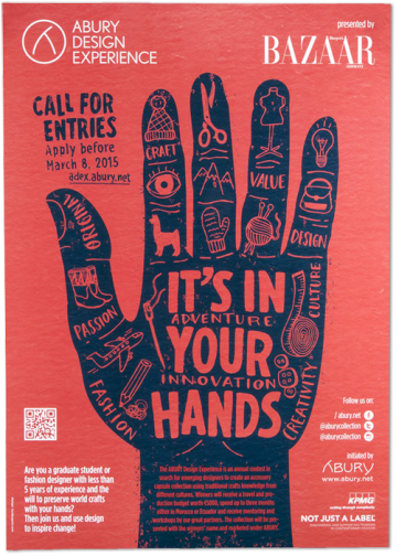
Abury
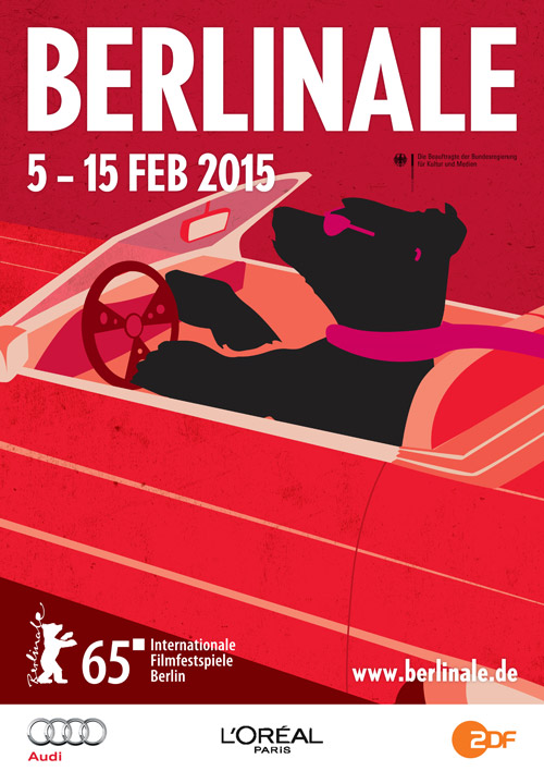
Berlinale 2015
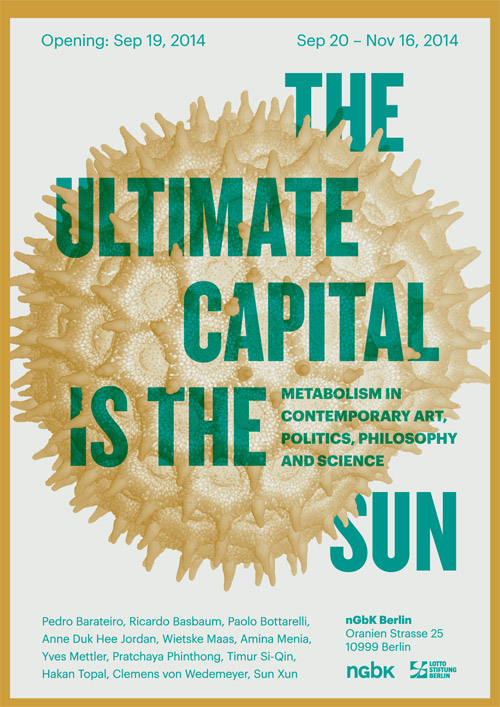
The Ultimate Capital is the Sun
FAI (Fondo Ambiente Italiano)
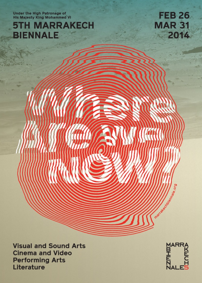
Marrakech Biennale 5
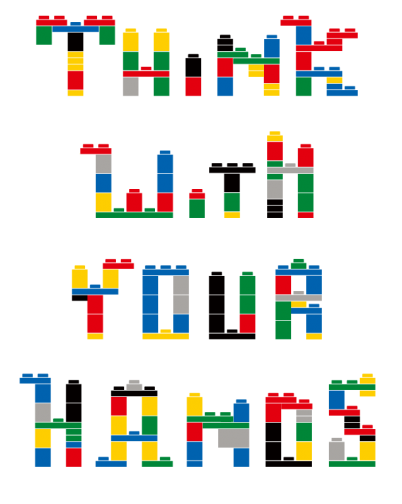
Moleskine Lego
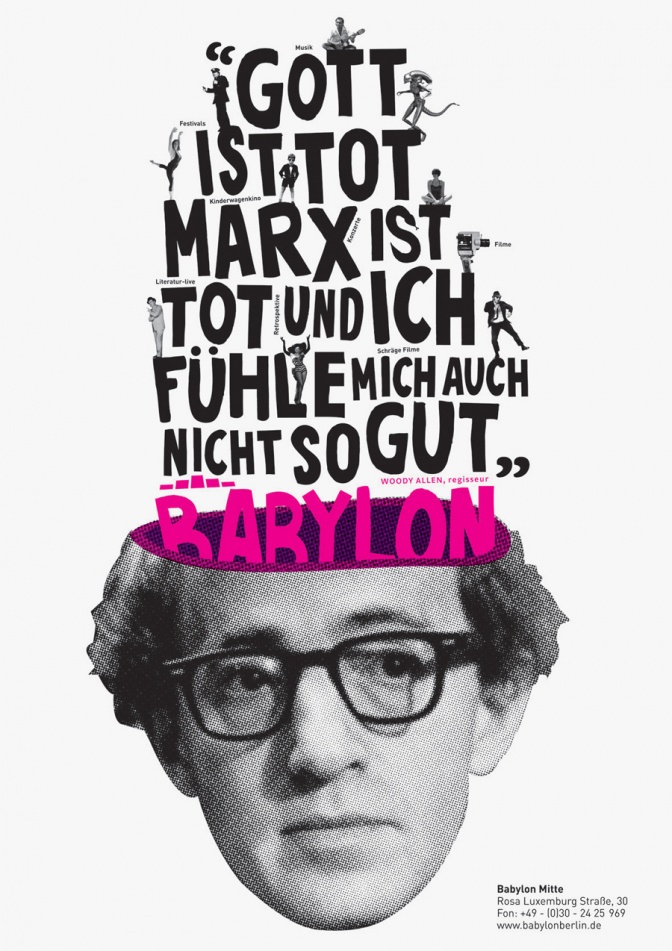
Kino Babylon
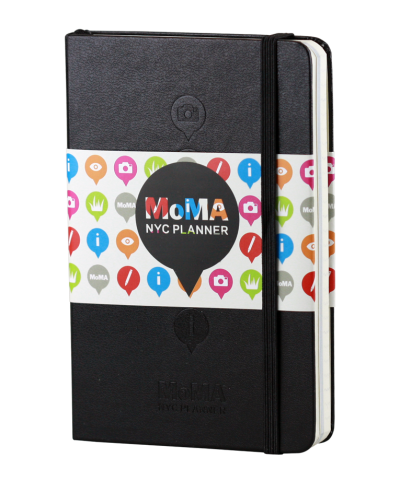
Moma NYC Planner
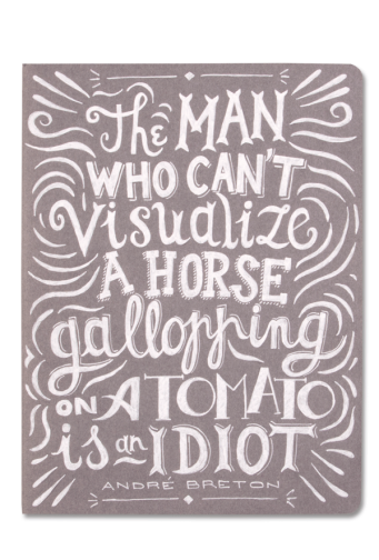
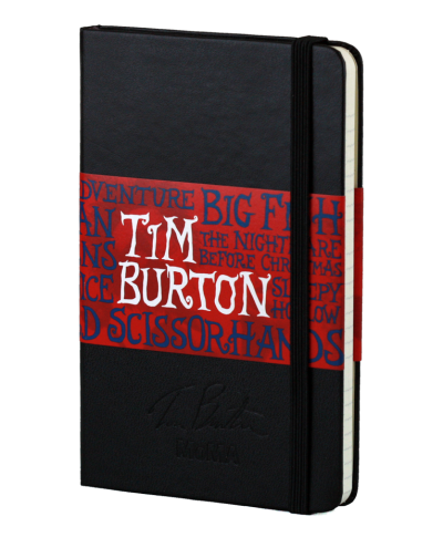
Moleskine Grey Cahier
Moleskine Salons
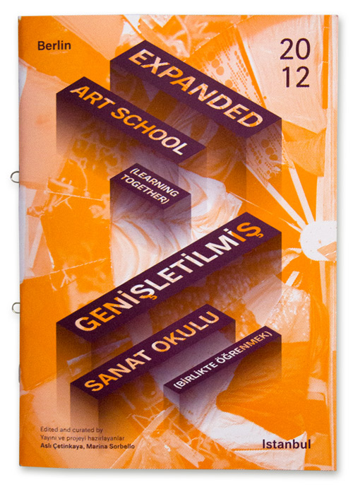
Expanden art school - catalogue
Target Special Edition
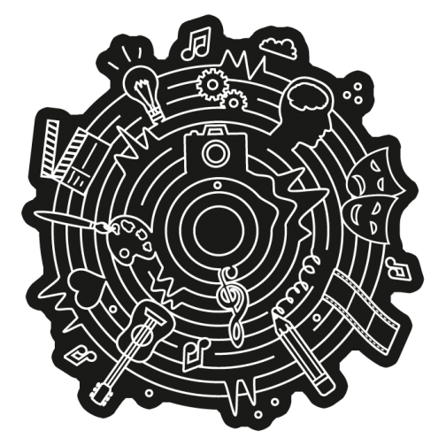
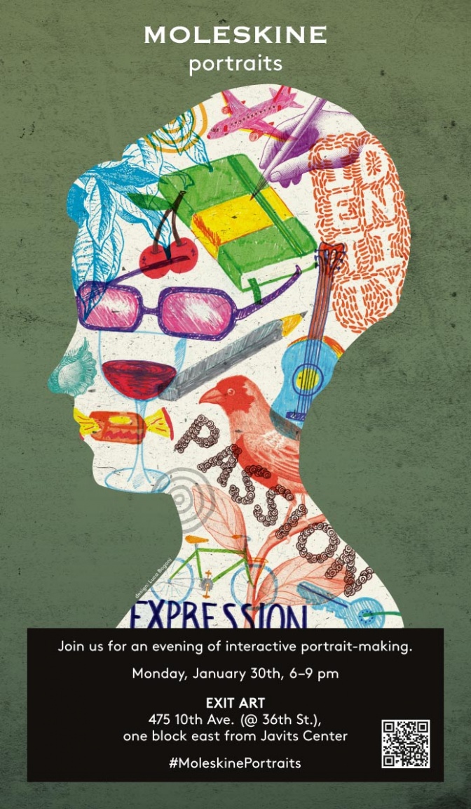
Portraits Event Identity
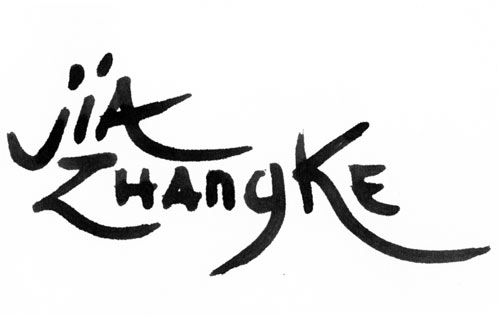
Jia Zhangke retrospective
Woodstock 40th Anniversary
MoMA directors' retrospectives
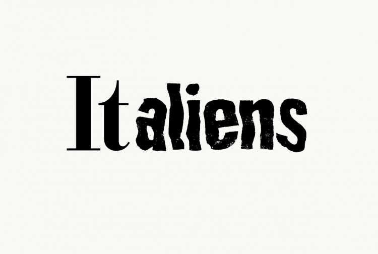
ITaliens, junge kunst in der Botschaft
ADC Young Guns 6
Playground
Hi
,
you can leave me a note:
Undo
Save
Gallery
What's your name?
Submit
Cancel